"Edusites Media has revolutionized my teaching, providing me with detailed, ready-to-use lesson plans that make my classes more engaging and effective." "The exam preparation materials have been a game-changer for my students, helping them to approach their exams with confidence and achieve higher grades." "I love how Edusites Media saves me time with comprehensive resources that cover every aspect of the curriculum, allowing me to focus more on my students' learning." "The diverse range of resources, from theory guides to practical production tasks, keeps my students motivated and excited about Media Studies every day."
He's Juxtaposer Him
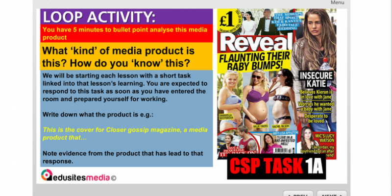
It will be beneficial for you to understand as much magazine front cover glossary as possible. There are the clear and obvious ones such as mastheads, fonts and main images. These are the obvious elements of a cover. And they will be there for a reason. They will exist on the cover in such a way that you can read into them and comment on how they have been applied.
For example, in the CSP, why do Reveal juxtapose the images of Peter Andre and Katie Price the way they do? There are literally thousands of photos of these two floating about the interweb, many of which could conceivably show them as normal, loving parents to their two children during happy phases of their marriage, but the designers of Reveal have positioned these two undoubtedly grating images so as to create a different and altogether more sinister ambience. Get the pupils discussing the connotation of this juxtaposition.
Register now for our subject updates and FREE instant access to this article.
Already registered? Login below to continue reading this article.